Spain property landing page · design shotgun

6 directions of the contact-first Spain page: two in the house style, two evolved, two on competitor patterns. Same final copy in all six. Each was judged on conversion, brand/compliance and craft, then fixed and re-scored. Click a screenshot or “Open full page” to use the real page. Rate, pick a preferred, write notes, then “Copy feedback JSON” and paste it back.

What we are replacing

The branch LP as built on 12 Sep (guide-length, calculator hero, four-node timeline). Shown for scale: the six variants are meant to be a fraction of this.

current LP desktop current LP mobile

Chair’s ranking

  1. C Shortest page of the six (517 words, 3825px desktop, 5440px mobile, roughly half the branch LP's 7252px) and the only one where the callback form is never more than one tap away: pinned beside the H1 on desktop, a bottom sheet from the fixed bar on mobile, with Tom's monogram card in the first fold. Cleanest answer to 'much less text, make people contact us'. Holds it back: a one-line novalidate bug, no photo or product imagery, and the desktop right column reads empty in a static capture.
  2. B The most native-looking of the form-in-hero variants: Altea photo hero with the callback card headed by Tom's initials, real platform screenshots (recipient list, forward calendar) flanking the mid-page CTA stack, house waves and Trustpilot band. Best proof that this is a real product, not a brochure. Holds it back: the callback links scroll UP to the hero form instead of down, the 'Rate alerts' tab clips at 390, the gradient was moved off-token, and mobile is still ~8 screens.
  3. F Opens and closes with the same lead form on navy, on desktop and mobile, so the ask is in the first fold everywhere and the page has zero exits; the giant pull-quote is a strong single testimonial. Holds it back: the decorative circles in How-it-works are filler occupying half a band, no imagery at all, and it reads as a competitor's template in CT colours rather than CT.
  4. D The best-looking page of the set: navy first fold, duotone panel, 300/700 Outfit H1 and the DM Mono facts rail (12 months / 2pm / Tom's phone) which is the single strongest signature moment across all six. Holds it back: it is the longest on mobile (7041px), the form lives only in the closing band, and the form-card title renders white on white.
  5. A The safest ship: the existing LP shell tightened, so a CT dev can paste it in unchanged, with a solid closing band (Tom card + form) and the corridor FAQ. Halves the old page's length and adds a form where the old page had only buttons. Holds it back: it still looks like the page we are replacing, the calculator card outranks the callback ask in the hero, the form is at the bottom only, and why-row bodies are uneven.
  6. E Tidy, flat, lots of contact routes (hero Tom card, Timing-matters band, closing form with green submit). Holds it back: the most words (596), the longest-feeling mobile (6932px, hero contact card duplicates header phone and bottom bar), a second button style foreign to the theme, and the flat blue blocks make it the most generic corporate page of the six.

Remix suggestion

Hero: C's copy stack and layout (eyebrow, H1, sub, Request a callback + Get Started, trust line, Trustpilot, Tom's TC monogram card beside the H1), no calculator, no hero paragraph, on B's Altea photo with the angled white divider so the page has one real image. Under the hero: D's facts rail (12 months / 2pm / Tom's phone) as the one bold line per fold. CTA mechanism: C's pinned callback card (sticky on desktop, bottom sheet from the mobile bar), which keeps the form in the first fold on both widths without duplicating markup; drop the second closing form and let the closing band carry Tom's card plus the two buttons that open the sheet. Mid-page: B's proof panel (recipient list + forward calendar flanking the Get Started / Request a callback / phone stack) in place of the how-it-works cards, with the four OPEN/ADD/BOOK/ARRIVE steps as D's numbered lines beside it. Tabs and FAQ from A (underline tabs, corridor accordion). Testimonial as F's single oversized pull-quote instead of a card band. Type: Lato only if the CT dev must paste it into the theme; otherwise C's Manrope headings. Buttons: house gradient primary kept per BRIEF 6, navy pill for the form submit.

Convergence check

Decisions for Stevan

#1 · Evolved

C · Concierge

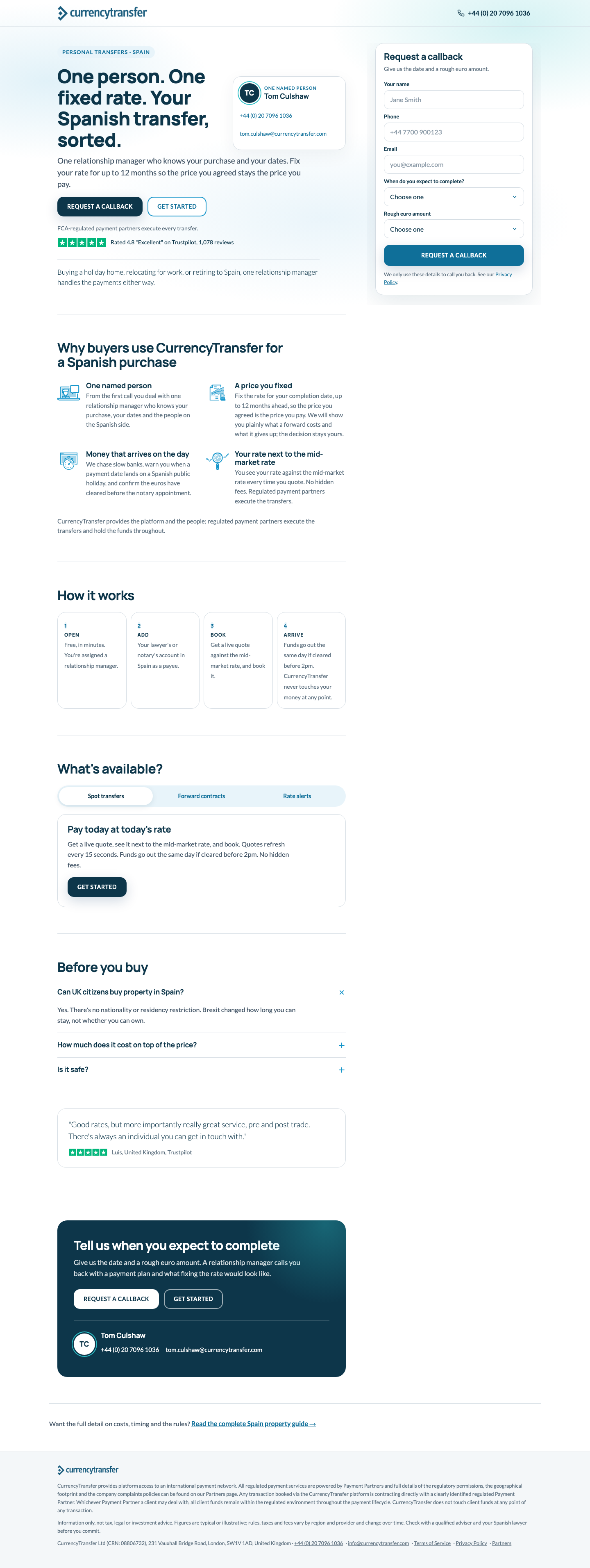
Person-first two-column page: the content column reads down the left while a "Request a callback" card stays pinned on the right the whole way (sticky on desktop, a bottom sheet on mobile), with Tom's TC monogram card sitting beside the H1 so the named contact is the first thing you see. Manrope display over Lato body, 20px-radius cards, hairline rules, one pale-blue mesh at the top, navy pills for CTAs.

8.3
Concierge desktop Concierge mobile

H1 One person. One fixed rate. Your Spanish transfer, sorted.

Signature The pinned callback card: it is in the first fold next to the H1, follows the reader down every section on desktop, and the same DOM node becomes the mobile bottom sheet from the fixed bar (phone + Request a callback), so the primary ask is never more than one tap away without duplicating the form.

Words 517 above the legal footer

conversion 8brand 9craft 8

Open items after the fix pass (11)
  • Line 347: `<form action="#" id="cb" novalidate="false">` turns novalidate ON (boolean attribute), so the required fields are not enforced and an empty submit shows the thank-you state; delete the attribute.
  • Email is optional in behaviour but still labelled plain 'Email' because '(optional)' is not in the copy sources; the founder needs to sign off adding the word or accept that users will not know they can skip it.
  • Below 600px the hero shows only 'Request a callback' (Get Started is hidden, carried by the fixed bar); a deliberate departure from the doc's two-CTA hero that the founder should be aware of.
  • Between 992 and 1199px the Tom card (max-width 300px) stacks under the H1 rather than beside it; the side-by-side hero only starts at 1200px.
  • Desktop sticky rail uses overflow-y:auto with a 20px side bleed and no top padding, so the card's 60px shadow is clipped at the top edge and beyond 20px each side (subtle halo cut).
  • Mobile page is still 5440px (about 6.5 screens at 390x844); the inline form sits after the closing card, so on mobile the form is only reached via the hero sheet or at the very bottom.
  • (builder) Mobile bottom bar is phone + Request a callback (opens the sheet), not phone + Get Started as in copy.md BAR; Get Started is still in the hero, all three tab panels and the closing card.
  • (builder) Hero paragraph, why-close paragraph and the standalone safe-q/safe-a block are dropped for length; safe-a's second sentence appears trimmed under the form card and 'Is it safe?' is covered in the FAQ.

Does best: shortest and most contact-first page, pinned callback card that becomes the mobile sheet, Tom beside the H1, calm 2026 finish with Manrope. Holds back: novalidate bug, no imagery so the right column looks empty in captures, Tom card stacks below 1200px, bottom bar deviates from brief (Request a callback, not Get Started).

Open full page ↗
#2 · House style

B · Product proof

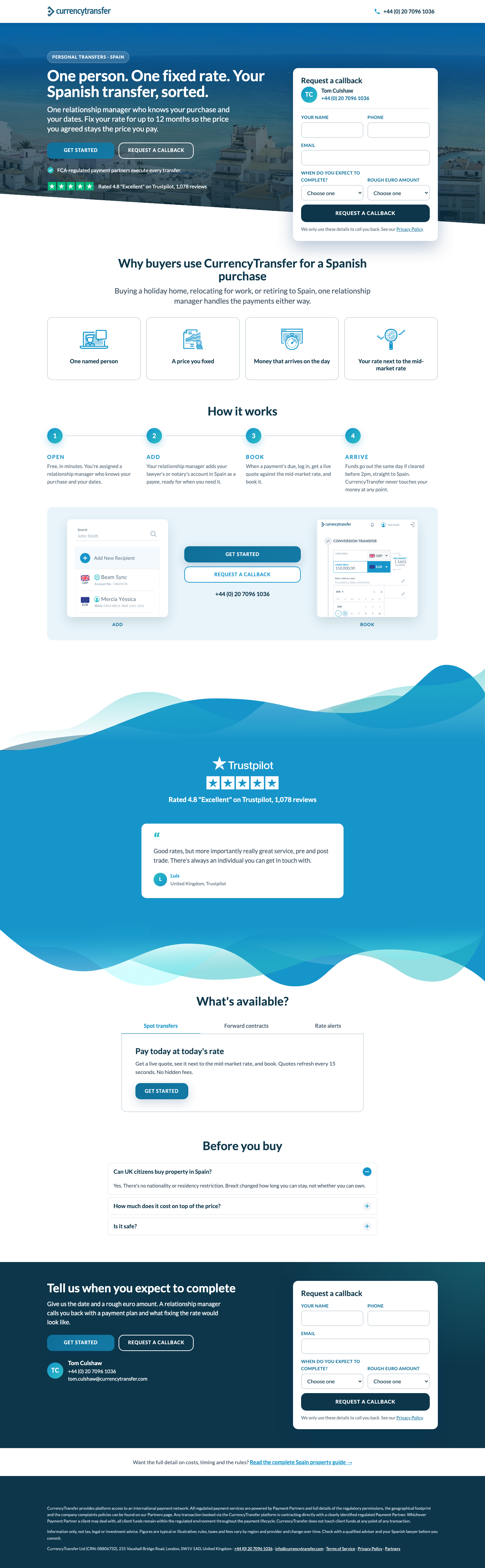
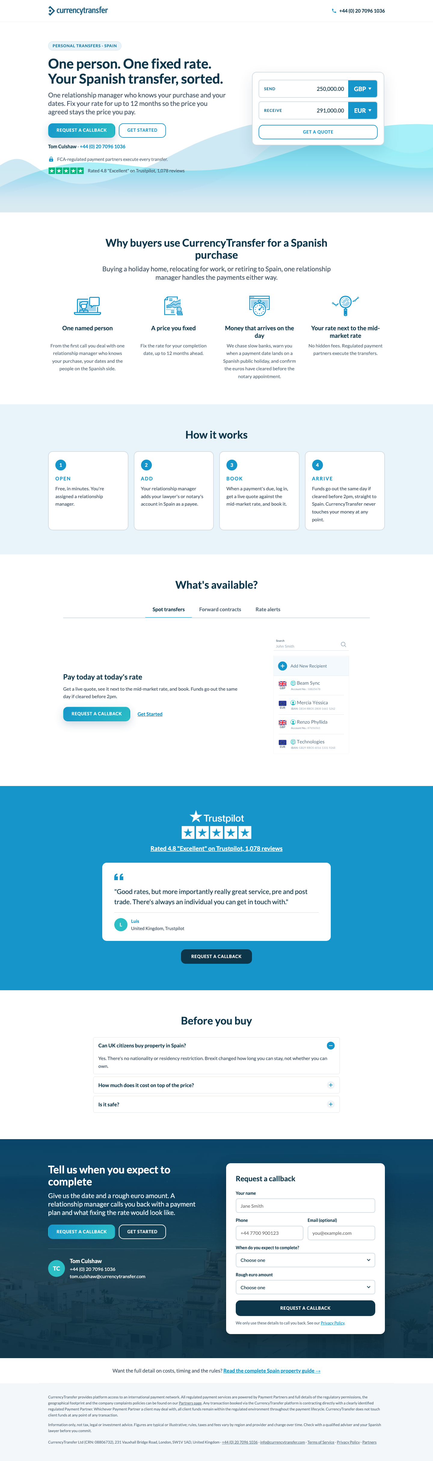
Saudi-LP lineage, photo-and-product led: dark Altea hero with white type and the angled white divider, the callback form as a white card inside the hero on desktop (hidden on mobile, where the header phone, hero CTAs and a sticky bottom bar carry the contact route); OPEN/ADD/BOOK/ARRIVE as a numbered horizontal stepper feeding a pale-blue proof panel that holds the recipient-list and forward-booking-calendar screenshots either side of a mid-page CTA stack; blue Trustpilot band framed by the homepage wave SVGs with one review card; underline tabs; corridor-style FAQ; navy closing band with Tom's monogram card and the form again. Lato only, house tokens throughout.

8.3
Product proof desktop Product proof mobile

H1 One person. One fixed rate. Your Spanish transfer, sorted.

Signature The hero form card that hangs over the angled photo edge, headed by Tom's "TC" monogram and phone, so the very first fold on desktop is the callback ask itself; second, the proof panel where the two real platform screens (ADD = recipient list, BOOK = forward calendar) flank the Get Started / Request a callback / phone stack so the CTA sits literally between the product evidence.

Words 580 above the legal footer

conversion 8brand 9craft 8

Open items after the fix pass (12)
  • Mobile 390: the third tab label 'Rate alerts' renders clipped to 'Rate ale' at the right edge (tablist is overflow-x:auto with nowrap tabs and no scroll affordance); needs wrap or tighter tab padding.
  • The .js-callback handler now prefers the hero card whenever it is rendered (i.e. always, since display:none was removed), so the 'Request a callback' links in the proof stack and forward tab scroll the user back UP to the hero form on every width instead of down to the nearer #callback closing form; only after the hero form is submitted does the closing form get used.
  • Primary button gradient is now #0f6f99→#147ba6 (AA 5.6:1/4.75:1), not the house #1695ca→#2cbec5 token from BRIEF 6; this weakens the family-1 'native to currencytransfer.com' claim and the founder has to choose between token fidelity and the brief's AA rule.
  • Mobile page is still 6,632px (~8 screens at 844): rendering the callback card under the hero absorbed the ~500px saved by hiding the BOOK shot and shrinking the frames; the fixer skipped further trimming as a deliberate trade.
  • Hero: the 15px trust line and Trustpilot rating line sit over the lightest part of the Altea photo (white buildings, bottom-left) now that the overlay is ~60% there; the fixer only checked the 22px sub copy, small white text contrast in that area is unmeasured.
  • Craft 8 was taken as 'narrow .tabs to 720px' only; there is no per-tab proof image, so the 'product proof' concept stops at the how-it-works panel and the tab panels remain text-plus-button.
  • (builder) Word count 580 visible words above the legal footer (counted by stripping tags from <body> to the footer, excluding <select> option text; 648 if option text is included). Got there by using why-row titles only, one testimonial (Luis), one tab body trimmed of the duplicated same-day line, and no placeholder text in the closing form. Further cuts would remove binding elements (two forms, two Trustpilot lines, tabs, FAQ).
  • (builder) Form submit button is navy #0D364A instead of the token green #41B412: white on that green is 2.7:1 and fails AA; navy is the BRIEF's sanctioned pill for CTAs on photo/dark bands, which is where both forms sit.

Does best: form in the hero headed by Tom, product screenshots as proof between the CTAs, house waves and photo. Holds back: js-callback scrolls users back up to the hero form; 'Rate ale' clip on mobile tabs; off-token button gradient; mobile length.

Open full page ↗
#3 · Competitor pattern

F · Lumon pattern

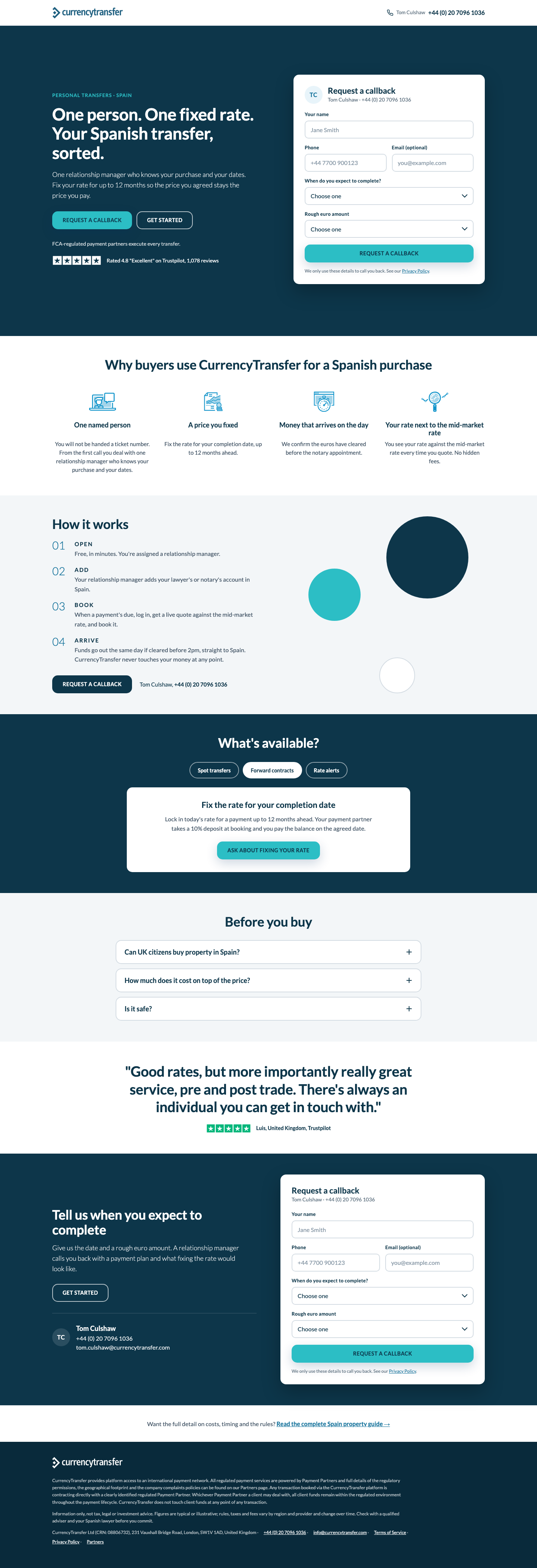
Type-on-navy hero with the callback lead form sitting in it (Tom's TC monogram and phone at the top of the card), then a white four-icon why row, grey/white/navy alternating bands with Lumon's decorative circles, a giant navy pull-quote, and the page closes the way it opens: a navy band with the same form beside Tom's contact details.

8.3
Lumon pattern desktop Lumon pattern mobile

H1 One person. One fixed rate. Your Spanish transfer, sorted.

Signature The lead form in the first fold on both desktop and mobile, headed by Tom's initials and direct line, with the two qualifying selects (completion timing, rough euro amount) borrowed from Lumon's budget/timing bands; the page opens and closes with that same card on navy.

Borrowed Lumon /buying-property-in-spain/ (ref/competitors/lumon-wayback-*.png): navy type-only hero, three/four-column icon why row on white, grey/white alternating bands, numbered step lines with decorative circles, a navy band of white cards each carrying its own button, one oversized pull-quote testimonial, and the navy lead-form band at the foot. Changes: the lead form is lifted into the hero (Lumon only has it at the bottom, NOTES.md pattern 1) and repeated in the closing band; Lumon's coral pill became a teal pill with navy text; the "currency considerations" two-card band became the required three-tab band where each tab panel is a white card with its own button (spot/alerts: Get Started, forward: Ask about fixing your rate scrolls to the closing form) to avoid duplicating copy; six FAQ cards became three accordion cards on grey; Lumon's promo bar, secondary nav, news cards and mega footer were dropped (zero exits above the closing ask); no gated PDF, the ask is a callback.

Words 571 above the legal footer

conversion 8brand 9craft 8

Open items after the fix pass (11)
  • Legal footer at 390: `.legal .row span:not(:last-child)::after{content:' ·'}` (line 151) uses a breakable space, so the mobile capture still shows a wrapped line opening with '· info@currencytransfer.com'; use content:'\00a0·' (non-breaking) to finish the fix. Desktop 1440 is correct.
  • Word count is about 566 by a tag-stripped count of <main> with select options excluded (fixer reported 560), so the page is still roughly 15 words over the 550 target rather than at it.
  • Spot transfers and Rate alerts tab panels still have no callback route (only Get Started); the fixer deliberately skipped the 'or request a callback' link, so in those panels the callback relies on the sticky header phone (desktop) or the gesture-triggered bottom bar (mobile).
  • Hero card keeps the 'Tom Culshaw · +44 (0) 20 7096 1036' subline (brand judge's suggested cut declined to keep the two cards identical and the phone at the point of submit); the header also carries the same line, so the number appears three times in the desktop first fold.
  • Mobile bottom bar (phone + Get Started) only appears after a scroll/touch gesture, so between the hero card (ends ~y1200) and the How-it-works callback button (~y2740) there is no contact route in a static capture; allowed by the brief but worth knowing when comparing mobile folds across variants.
  • Desktop hero at 1440x900 has about 130px of empty navy above the eyebrow and below the card due to the min-height:min(100vh-69px,900px) centring rule; cosmetic, but the first fold reads a little airy compared with the rest of the page's 56px rhythm.
  • (builder) Visible word count is 571 (select dropdown options excluded; 639 if counted), about 20 over the 550 target; everything left is mandated blocks and the second form's labels. why-1..4 are shown as shortened doc sentences, hero paragraph, why-close and the safe-a paragraph were dropped, and the closing form omits the privacy line (kept on the hero form).
  • (builder) Mobile bottom bar (phone + Get Started, orange) appears only after the first real gesture once the hero CTAs have scrolled off, so it is absent from the static full-page capture; it never shows on desktop.

Does best: lead form in the first fold on desktop AND mobile with the qualifying selects, bookended by the same form at the close, big pull-quote. Holds back: decorative circles are filler, no photo or product proof, spot/alerts tabs have no callback route, phone appears three times in the desktop first fold.

Open full page ↗
#4 · Evolved

D · Editorial navy

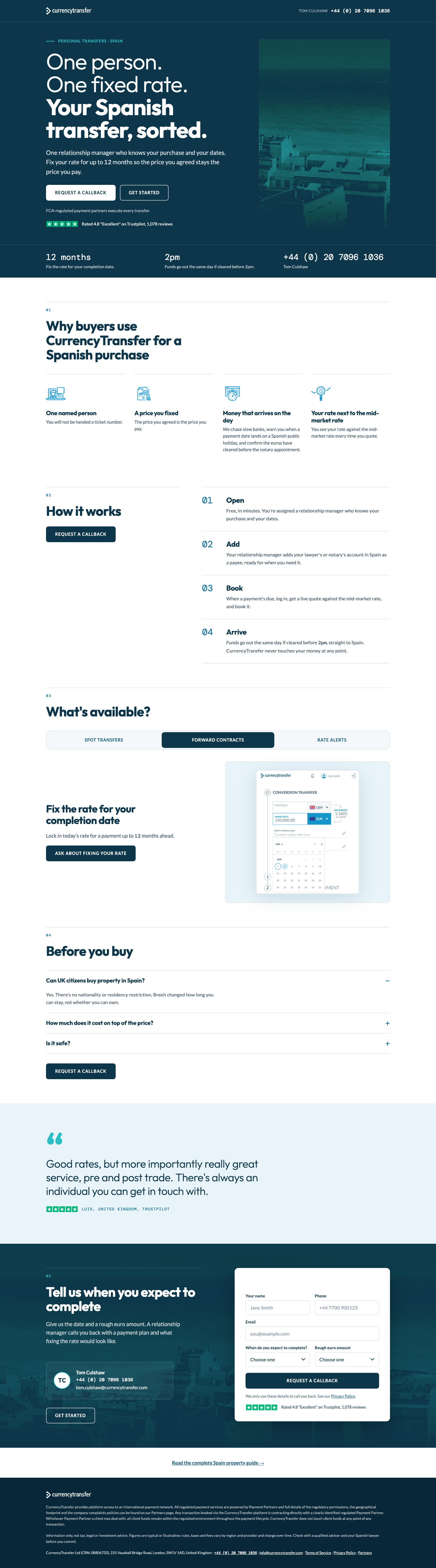
A full-navy first fold with the Altea photo as a real teal/navy duotone panel, a 74px Outfit H1 that steps from 300-weight to 700, DM Mono numerals for the phone and the 12-month / 2pm facts, numbered hairline-ruled sections (01-05) with one bold display line per fold, a full-width three-segment control with a platform screenshot per tab, and a dark closing band carrying Tom's monogram card plus the callback form. Lato body, CT blues only, no gradients or blobs.

8.3
Editorial navy desktop Editorial navy mobile

H1 One person. One fixed rate. Your Spanish transfer, sorted.

Signature The facts rail pinned to the bottom of the first fold: "12 months", "2pm" and Tom's phone number set in DM Mono at 28px with a one-line verbatim label under each, so the three things a buyer needs (fix the rate, same-day cut-off, a person to ring) are readable before scrolling and the phone number is a tap target on desktop and mobile.

Words 564 above the legal footer

conversion 8brand 9craft 8

Open items after the fix pass (11)
  • Form card title 'Request a callback' (.form-card h3) renders white on the white card because .dark h3{color:#fff} is never overridden; both screenshots show a blank ~50px strip above 'Your name'. One-line fix: .form-card h3{color:var(--navy)}.
  • Fixer's deliberate deviation: the Tom monogram card was removed from section 02 (How it works), so the sticky aside holds only the H2 and the callback button; Tom's name/phone/email now appear in the header, facts rail, closing band and footer only.
  • Input placeholders (#8a99a6 on white) are 2.9:1; labels carry the meaning so this is a minor AA note, not a blocker.
  • Rate-alerts tab image is a fixed crop of the top 52% of the illustration; the container clips the phone body, which reads as intentional but is not the full asset.
  • Focus-on-scrollend for #callback links relies on the 'scrollend' event (Safari 18.4+); older Safari falls back to a 1,500ms timer, which can still pop the keyboard early on a slow mobile scroll.
  • Mobile page is still 7,041px (about 8.3 viewports at 844px) even after the padding cap; the desktop cut was larger (5,174px) because the mobile length is mostly stacked content, not air.
  • (builder) Word count is 564 visible words above the legal footer (598 if the five-option dropdown texts are counted); target was ~550. Cheapest further cut is the hero-bottom facts rail (about 20 words) but it is the variant's signature element, so left in.
  • (builder) Form submit button and the primary CTAs are navy/white rather than the brand green (#41B412) and blue-teal gradient tokens: white text on those colours is 2.7:1 and 3.4:1, below the BRIEF's AA rule, so the palette was restricted to pass contrast.

Does best: the facts rail (12 months / 2pm / phone in mono) and the navy editorial fold; the most distinctive and premium page. Holds back: longest mobile page, form at the bottom only, invisible form title, Tom card removed from section 02.

Open full page ↗
#5 · House style

A · House LP

The branch LP's own shell tightened to the new copy: white hero on the personal-transfers wave SVG, H1 left with the two CTAs, trust line and Trustpilot strip, static calculator card right; four-icon why-row, four numbered step cards on a pale band, underline tabs with a product screenshot per tab, blue Trustpilot band carrying the Luis quote, corridor-style FAQ accordion, navy closing band over the Altea photo with Tom's TC card and the callback form, guide link, grey legal footer. Lato only, every component from design-kit.md.

8.3
House LP desktop House LP mobile

H1 One person. One fixed rate. Your Spanish transfer, sorted.

Signature The closing band: Altea photo under a navy scrim, Tom Culshaw's TC monogram with phone and email on the left, the white callback form on the right with a navy pill submit that flips to an inline thank-you; every "Request a callback" button on the page scrolls here and drops focus into the name field.

Words 591 above the legal footer

conversion 8brand 9craft 8

Open items after the fix pass (11)
  • Why-row bodies are now uneven: 'One named person' and 'Money that arrives on the day' run 4-5 lines while 'A price you fixed' and 'Your rate next to the mid-market rate' run 2 lines, leaving visible empty space under columns 2 and 4 on desktop and in the 2-up mobile grid (a side effect of restoring the full doc sentences; trim why-1 and why-3 to one clause each or accept the gaps).
  • Spot-transfers tab proof is app-ss-recipient-list.min.svg (a payee list with dummy 'DE04 RBOS' / 'GB29 RBOS' IBANs), which does not show the 'live quote next to the mid-market rate' the panel copy describes; no GBP/EUR quote-screen asset exists in the brief's list, so this is the best available but it is weak proof.
  • Mobile page is 6784px (about 8 viewport-heights at 390x844) against the brief's 2-3 scrolls target; the how-it-works cards, tabs panel, Trustpilot band and closing form each take roughly a screen, so further cuts would need to drop a section, not just tighten spacing.
  • Tab buttons deviate from copy.md, which specifies 'Get Started' as the spot and rate-alerts button: the page leads with a primary 'Request a callback' and keeps Get Started as a plain text link (judge-requested; founder to confirm the tabs should feed the callback ask rather than sign-up).
  • Tom is named only in the hero tel line, the FAQ 'Is it safe?' line, the thank-you state and the closing contact block, not inside the 'One named person' why-card (skipped because the card body is the verbatim doc sentence and inserting his name would rewrite it).
  • Mobile first fold shows Get Started twice (secondary hero button plus the orange bottom-bar button) against one callback button; the bar keeps Get Started because BRIEF 3 and copy.md fix the bar as phone + Get Started, so the only mitigation applied is hiding the bar while the form is on screen.
  • (builder) Word count: 591 counting every word in the DOM above the legal footer (includes the 34 words of select options, the two hidden tab panels and the hidden thank-you state); 518 visible at load. Why-row bodies, three tab bodies and steps OPEN/ADD are trimmed fragments of the doc copy; why-close, hero-para, safe-a and form-next were dropped to get near the budget.
  • (builder) House gradient primary button (white 14px text on #1695ca to #2cbec5) is below AA 4.5:1 at the teal end; kept because BRIEF section 6 specifies it. Form submit uses the navy pill (#0D364A) instead of green #41B412 for AA.

Does best: native CT shell, corridor FAQ, closing band with Tom's card and the form, pasteable as-is. Holds back: reads as the old page with less copy; calculator competes with the callback; form only at the very bottom; mobile ~8 screens.

Open full page ↗
#6 · Competitor pattern

E · Currencies Direct pattern

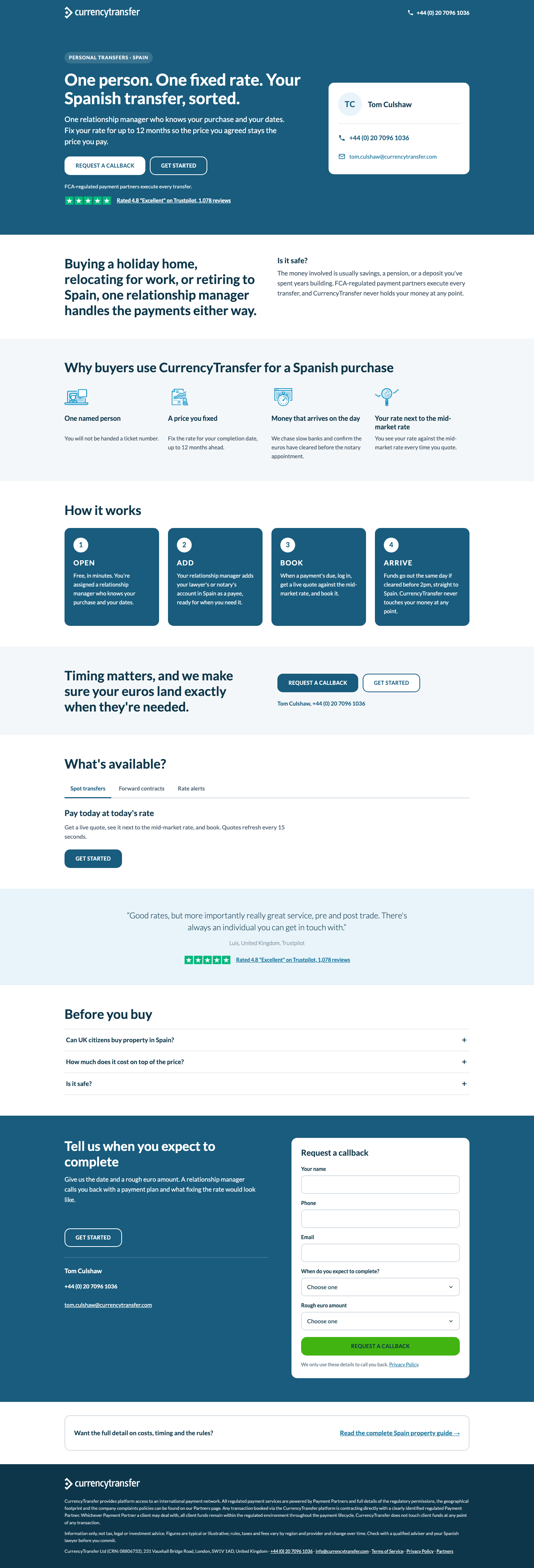
Flat corporate blue: a solid #195C7D block from header through hero (white H1, two pill CTAs, trust line, Trustpilot), a heading-left/text-right intro, four-icon why row, four numbered solid-blue step tiles, a two-CTA "Timing matters" band, tabs, one quote band, FAQ accordion, then a full-width blue closing band that carries the callback form beside Tom's contact, and a plain guide-link card before the legal footer.

8.3

Currencies Direct pattern desktop Currencies Direct pattern mobile

H1 One person. One fixed rate. Your Spanish transfer, sorted.

Signature The ask-proof-steps-ask spine: the flat blue hero with "Request a callback" / "Get Started" side by side and the Trustpilot line directly under them, echoed by the four numbered solid-blue OPEN/ADD/BOOK/ARRIVE tiles and closed by the same blue band holding the form itself.

Borrowed Currencies Direct /en-gb/buy-property-abroad/spain (ref/competitors/currencies-direct-wayback-*.png): flat solid-blue hero with white left-aligned H1, two equal pill CTAs and the Trustpilot line under them; a heading-left/text-right two-column intro; numbered solid-blue tiles for the process; a two-column text-plus-CTA "save on currency" band; a full-width blue closing band; FAQ accordion; then a link card. Changed: hero's empty right half becomes Tom Culshaw's contact card (TC monogram, tel, mailto) so a human route sits in the first fold; six guide tiles become the four product steps; CD's account-signup-only ask becomes a callback form living inside the closing blue band (CD has no form anywhere); header is logo + phone only, no nav, no mega footer; 17 guide sections cut to 10 short ones; CD's deep blue/bright blue re-skinned as CT #195C7D blocks with #1695CA accents, Lato throughout; a mobile-only bottom bar (phone + Get Started) appears once the hero's own CTAs scroll off; FAQ placed before the closing band so the ask is last and the guide link is the last thing before the legal footer.

Words 596 above the legal footer

conversion 8brand 9craft 8

Open items after the fix pass (11)
  • Mobile page is still 6,932px (~8 screens at 390x844); the hero contact card (TC monogram, phone, email) stacks under the hero CTAs on mobile and duplicates both the header phone and the bottom bar, so it is the obvious ~200px to cut if length matters.
  • Buttons are flat #195C7D pills, not the house gradient primary (#1695CA to #2CBEC5, 15px radius); this is the intended Currencies Direct re-skin, but a CT dev pasting this into the theme would be introducing a second button style.
  • Why-row item 4 title (Your rate next to the mid-market rate) still wraps to two lines on desktop; the min-height aligns the bodies but the four titles sit at uneven heights.
  • Header phone link on mobile is icon-only: the tap target is 44x44 but the glyph is 18px white on #195C7D and is easy to miss at the top right of the first screen.
  • Mobile bottom bar container is a div with aria-label but no role, so the label is not announced; harmless but the attribute does nothing.
  • Tab-panel and thank-you sentences (e.g. Quotes refresh every 15 seconds; Ask about fixing your rate) were not re-checked against copy.md in this pass because the task did not name that file; the original brand judge passed them.
  • (builder) Word count is 596 (589 on desktop where the mobile bar is hidden), about 8% over the 550 target after cutting the hero paragraph, shortening the why-row to one-liners, trimming tab bodies, and dropping the mid-page Tom line and repeated Trustpilot text; remaining copy is doc-mandated blocks (steps, FAQ, closing, form labels). Count excludes select options, the hidden thank-you state and the legal footer.
  • (builder) Why-items 1, 2 and 4 are shown as trimmed one-line bodies (allowed by BRIEF), so the doc's fuller why-1/why-2/why-4 texts and the why-close second sentence are not on the page; the 'Is it safe?' key-things paragraph appears as the intro text without its question heading.

Does best: many contact routes and a clear ask-proof-steps-ask spine; green submit is the only one on the brand token. Holds back: most words, duplicate contact card in the hero on mobile, flat pills introduce a second button system, looks like any corporate FX page.

Open full page ↗

Overall direction